00/24
In-house Crafts
by a Plus Team
Fun times also fuel growth.
In the daily rhythm of client work and deadlines, it’s essential to carve out spaces where creativity can flow freely. So, we challenged our in-house designers with a special project: take a phrase or object as inspiration and create a poster through their unique artistic lens.
What began as a playful creative exercise soon evolved into a powerful reminder of how personal expression fuels professional excellence.
→ A creative journey where personal expression meets professional growth.
We've always believed that personal expression isn’t just about creative freedom – it’s a catalyst for professional development. When designers are encouraged to explore their unique voices, they cultivate stronger problem-solving skills, build confidence in their creative decisions, and gain a deeper understanding of their artistic strengths.
00/24
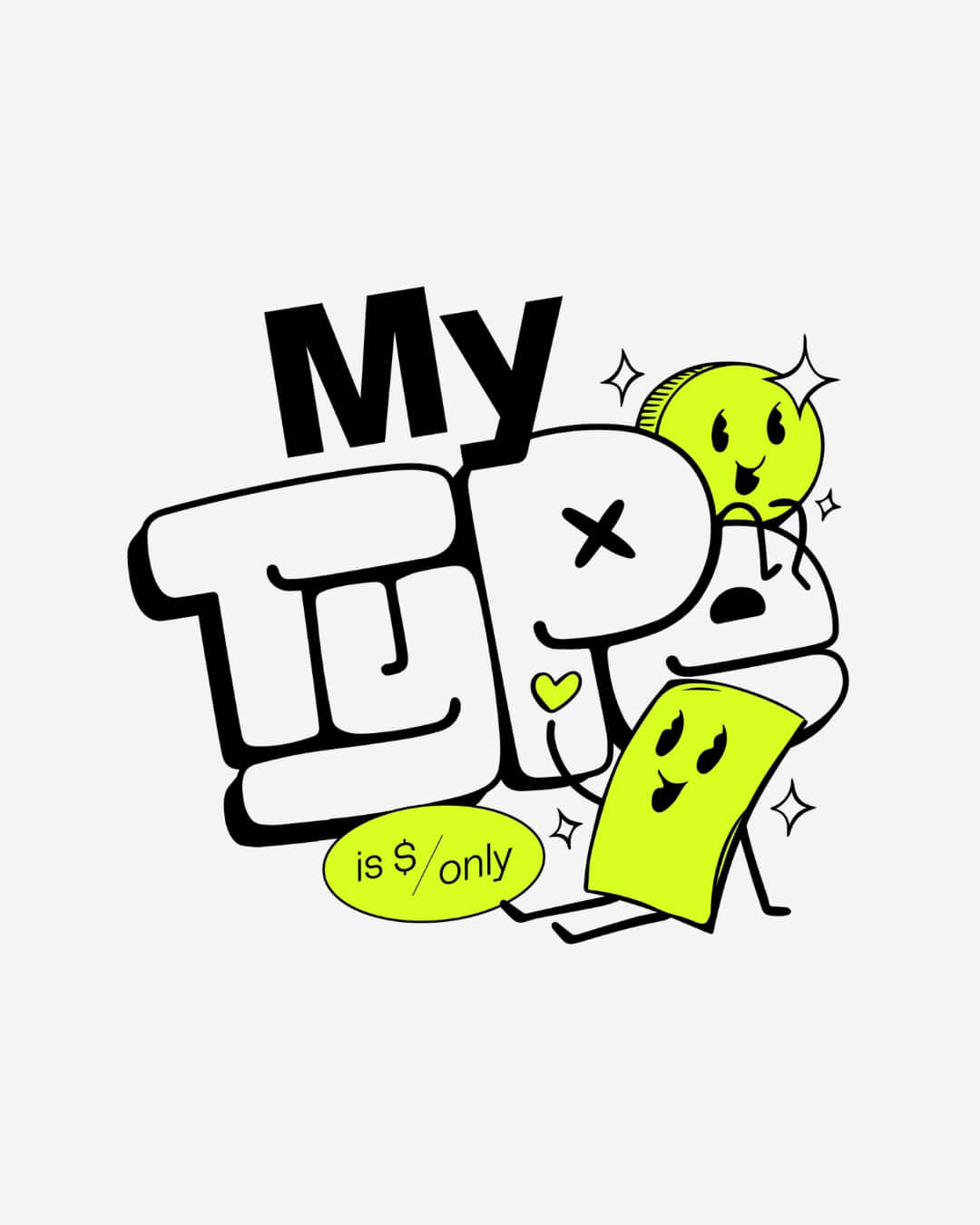
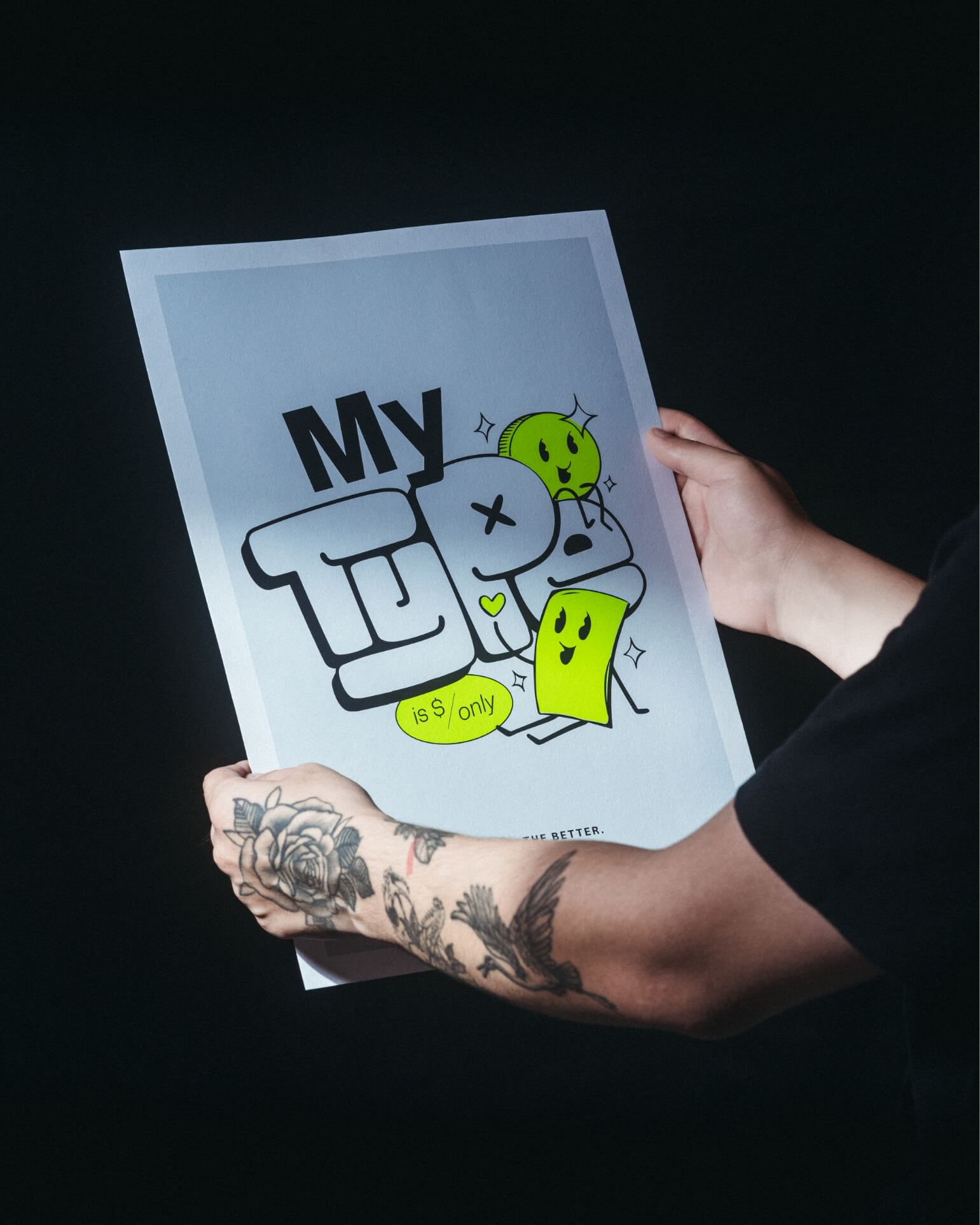
"My type is $ only" blends the boldness of pop art with the charm of kawaii and the edge of street art, creating a youthful, quirky, and lighthearted tone. Its exaggerated, bubbly typography and the expressive, cute faces and limbs on the coin and dollar bill add a sense of humor and whimsy.
The Impact of Kawaii
"My type is $ only" blends the boldness of pop art with the charm of kawaii and the edge of street art, creating a youthful, quirky, and lighthearted tone. Its exaggerated, bubbly typography and the expressive, cute faces and limbs on the coin and dollar bill add a sense of humor and whimsy.
01.
"My type"
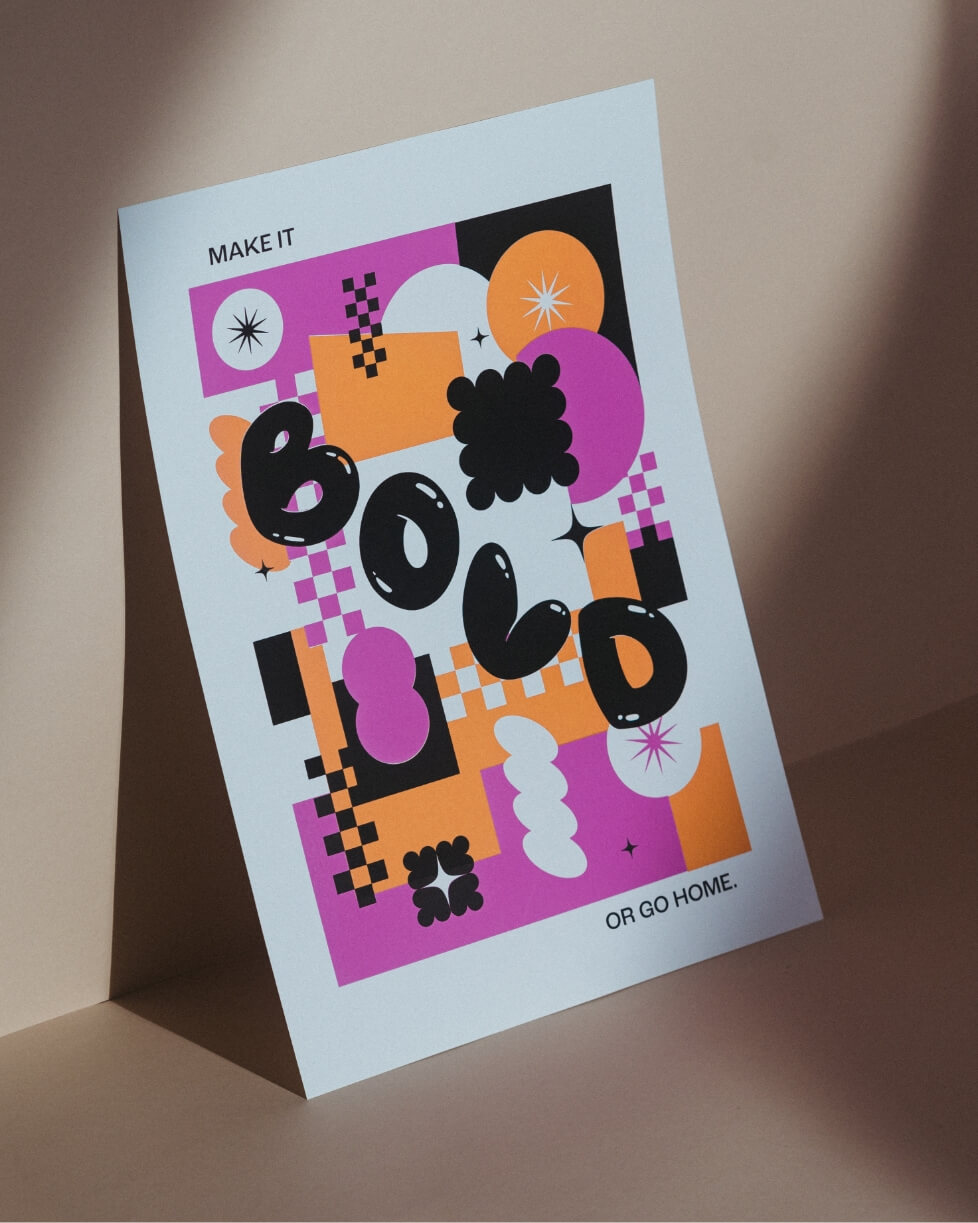
→ The Classics Are Classic
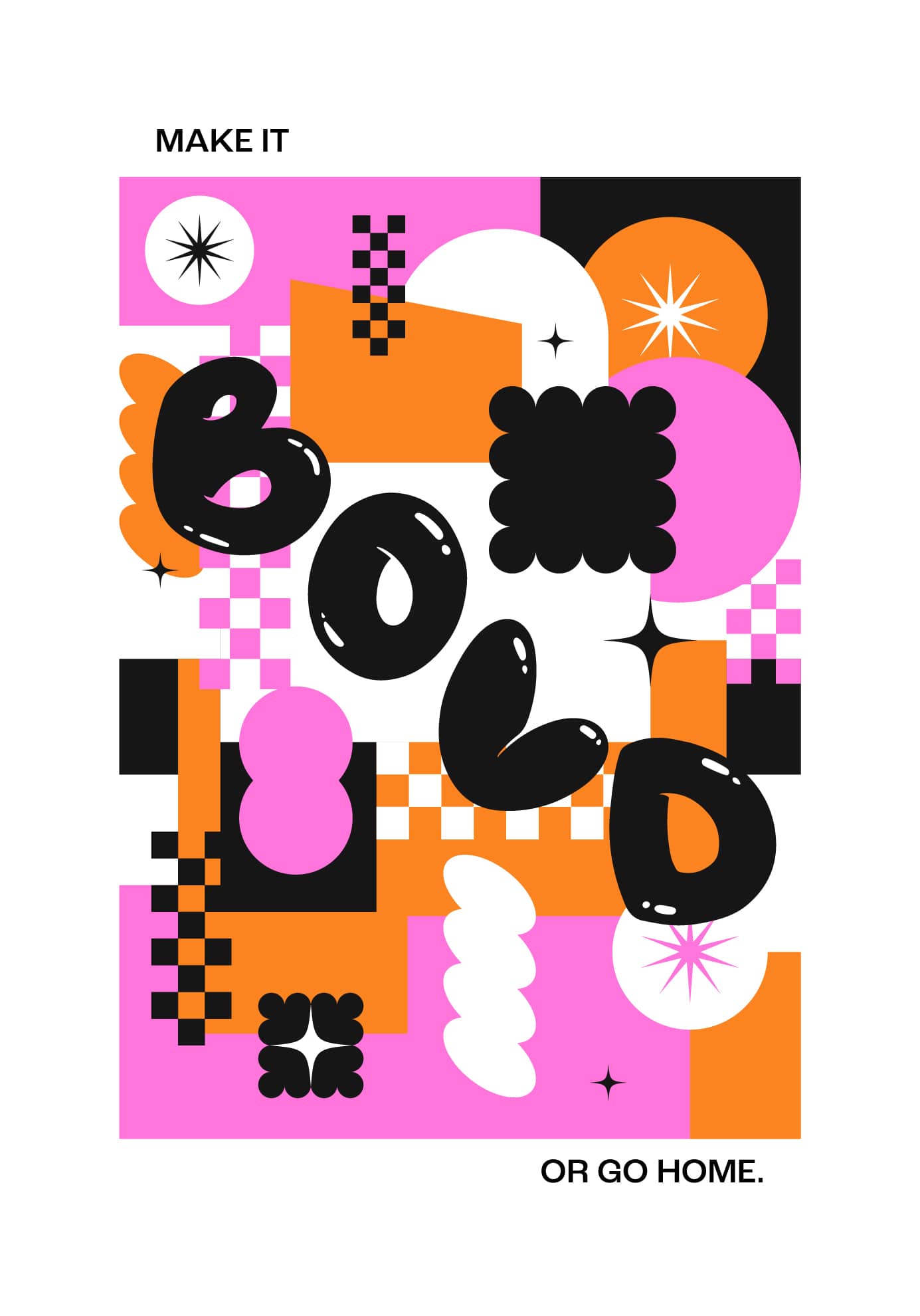
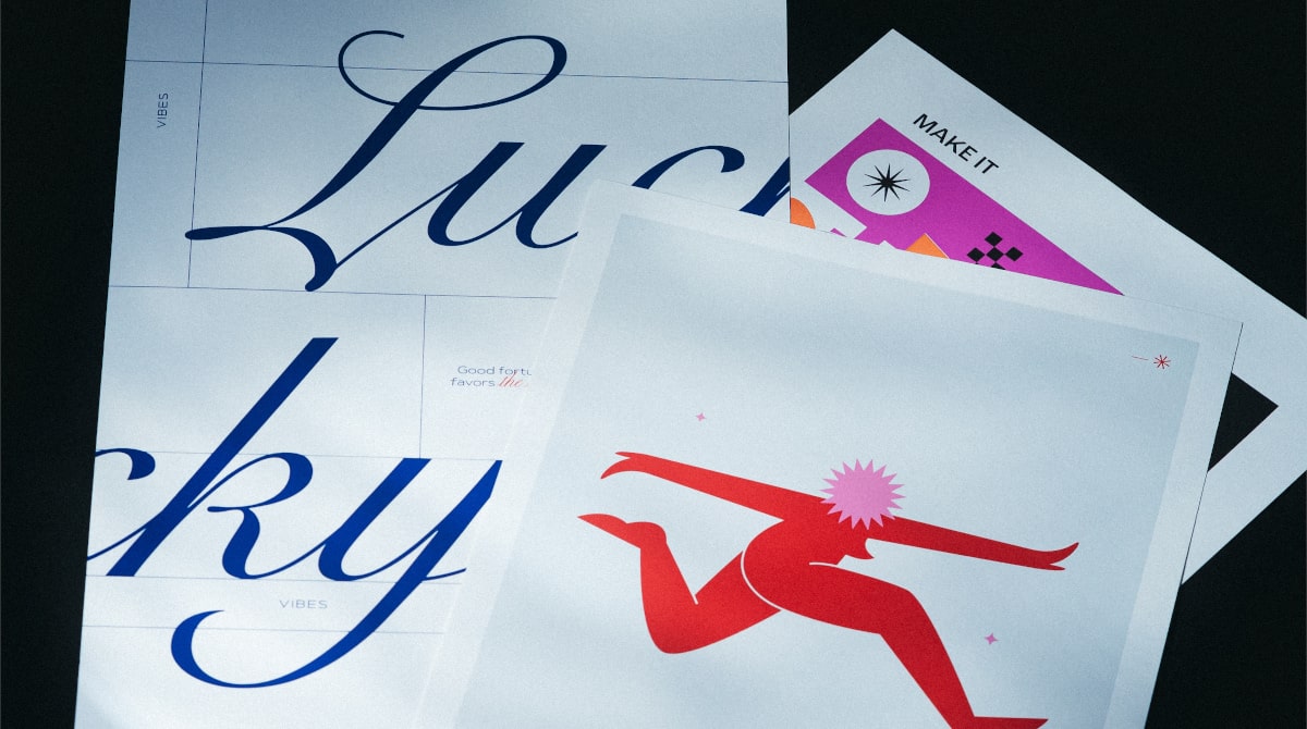
The take on "Make it bold or go home" draws from retro-futurism and pop art, with bright colors and graphic elements that capture the bold aesthetic of the 80s. The maximalist approach emphasizes confidence and vibrancy, demonstrating how a passion for design history can inform modern solutions.
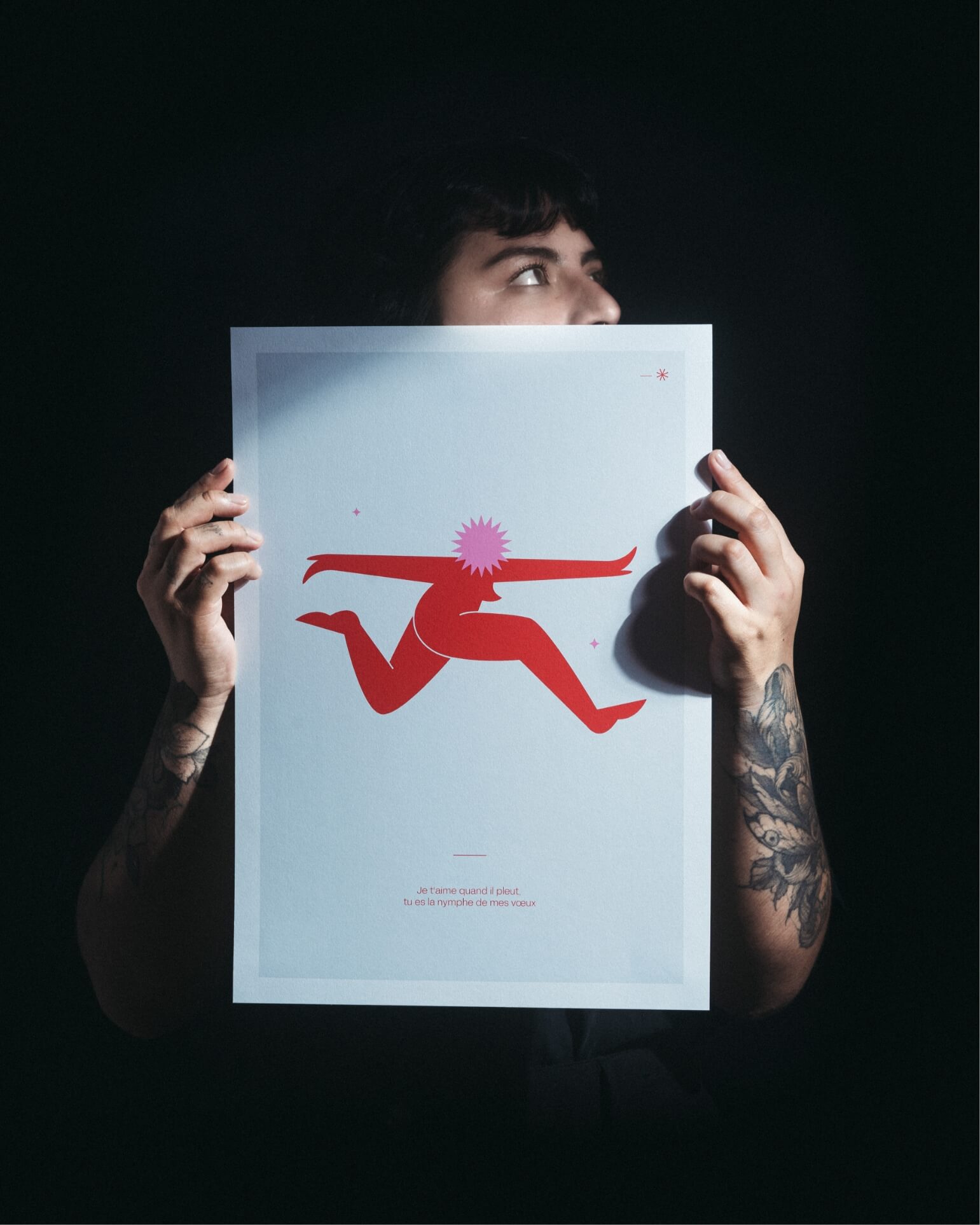
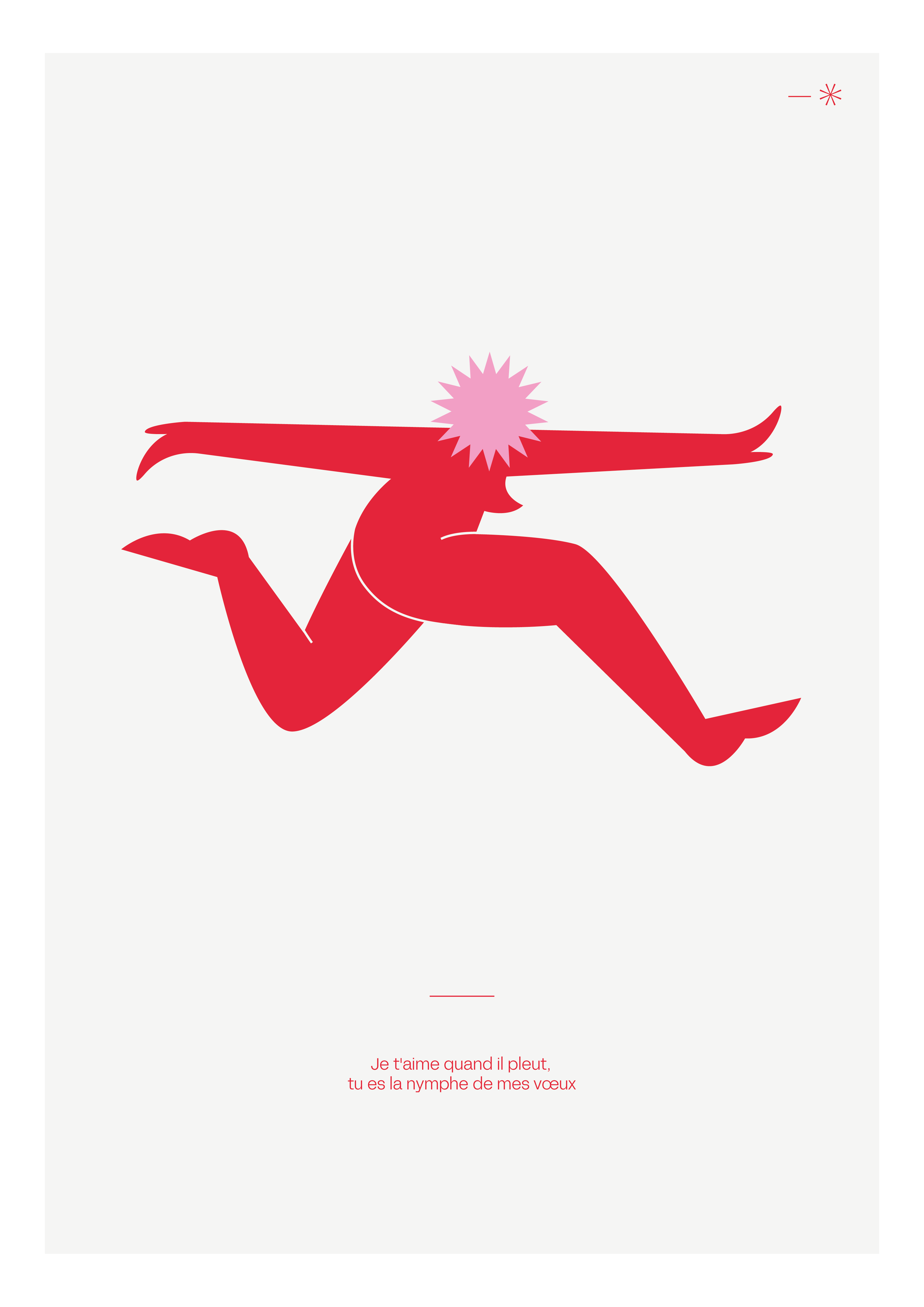
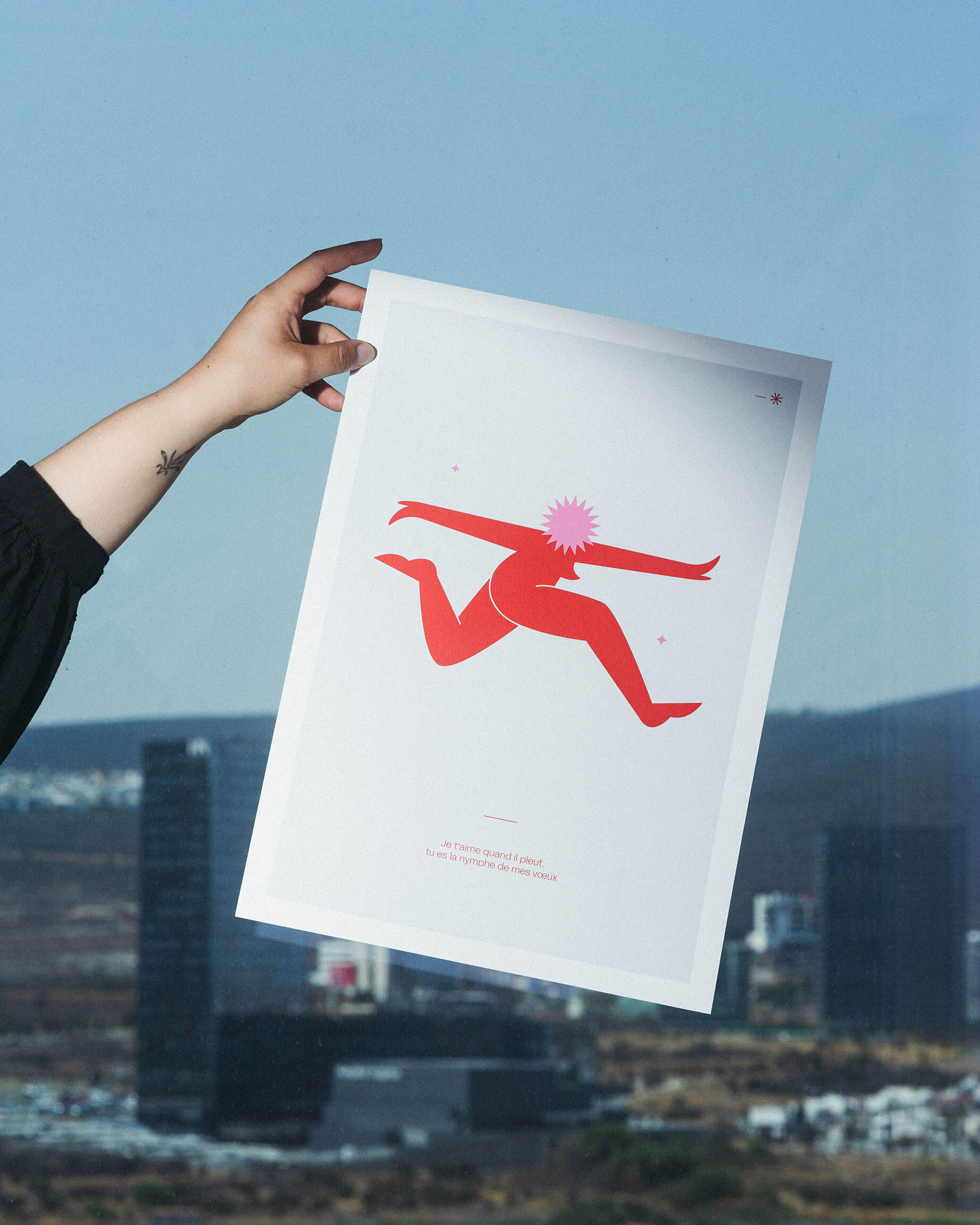
This minimalist, abstract, and surreal interpretation of “Je t´aime quand il pleut, tu es la nymphe de mes voeux” – “I love you when it rains, you’re the nymph of my desires” – uses flat colors and geometric shapes to convey emotion and movement with a poetic and introspective aesthetic. The artwork combines simplicity and emotional depth, making it both delicate and powerful in its restraint.
02.
“Roi”
The beauty in abstraction
03
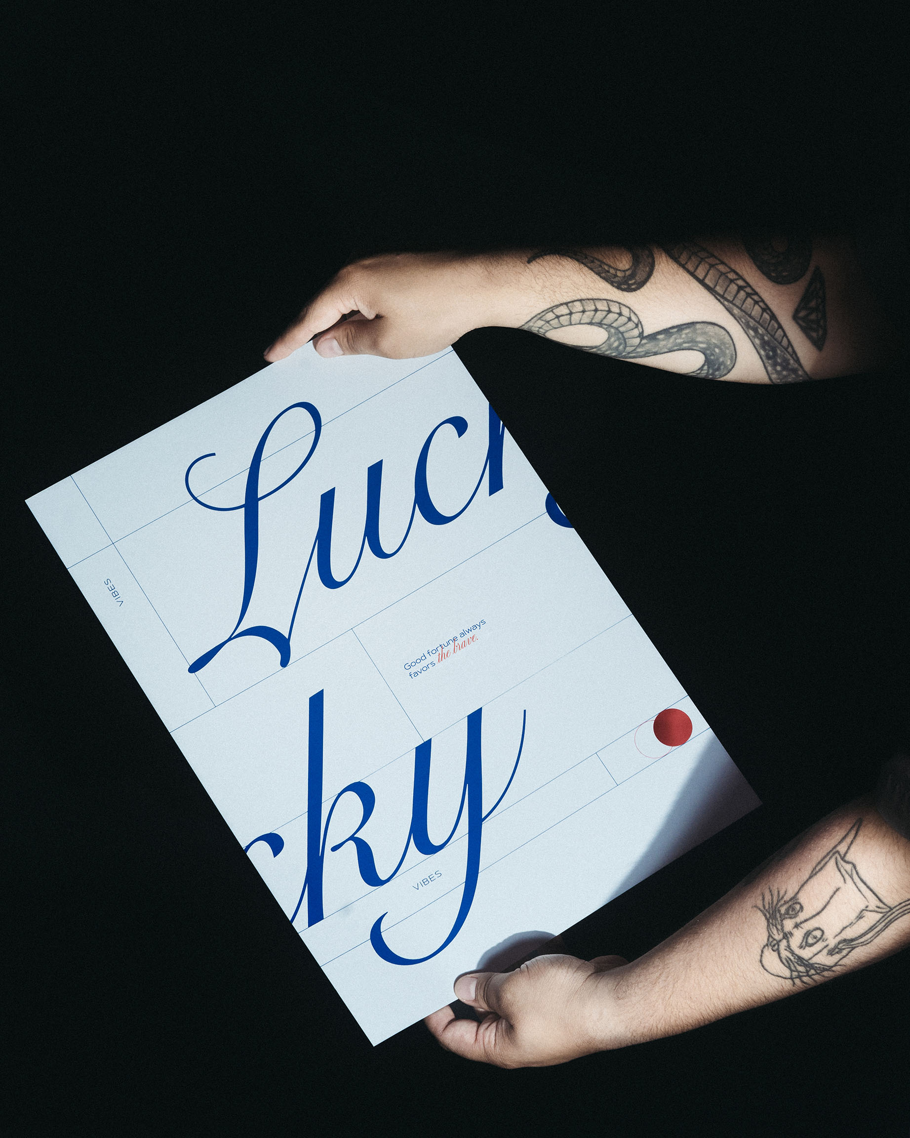
“Lucky vibes”
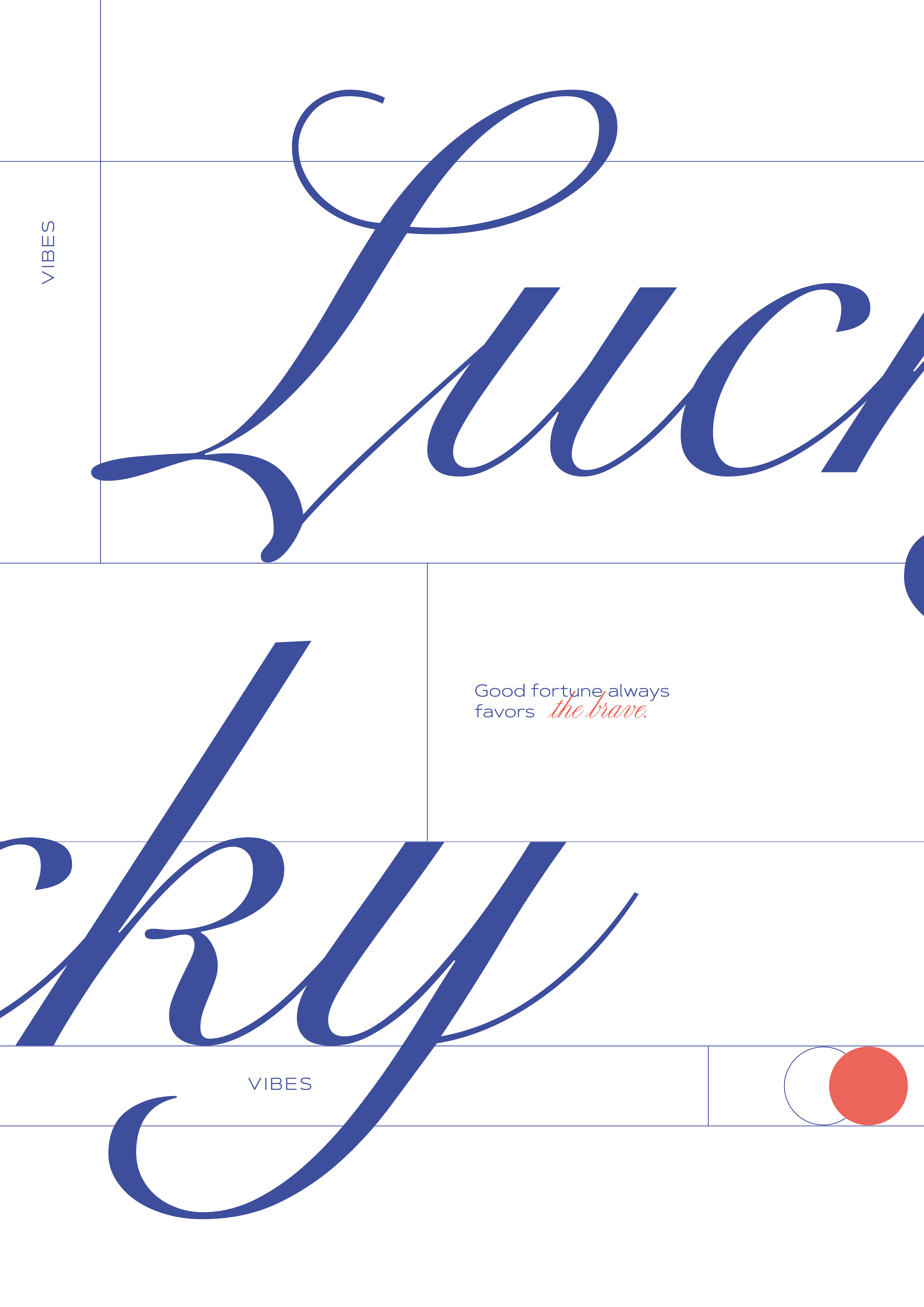
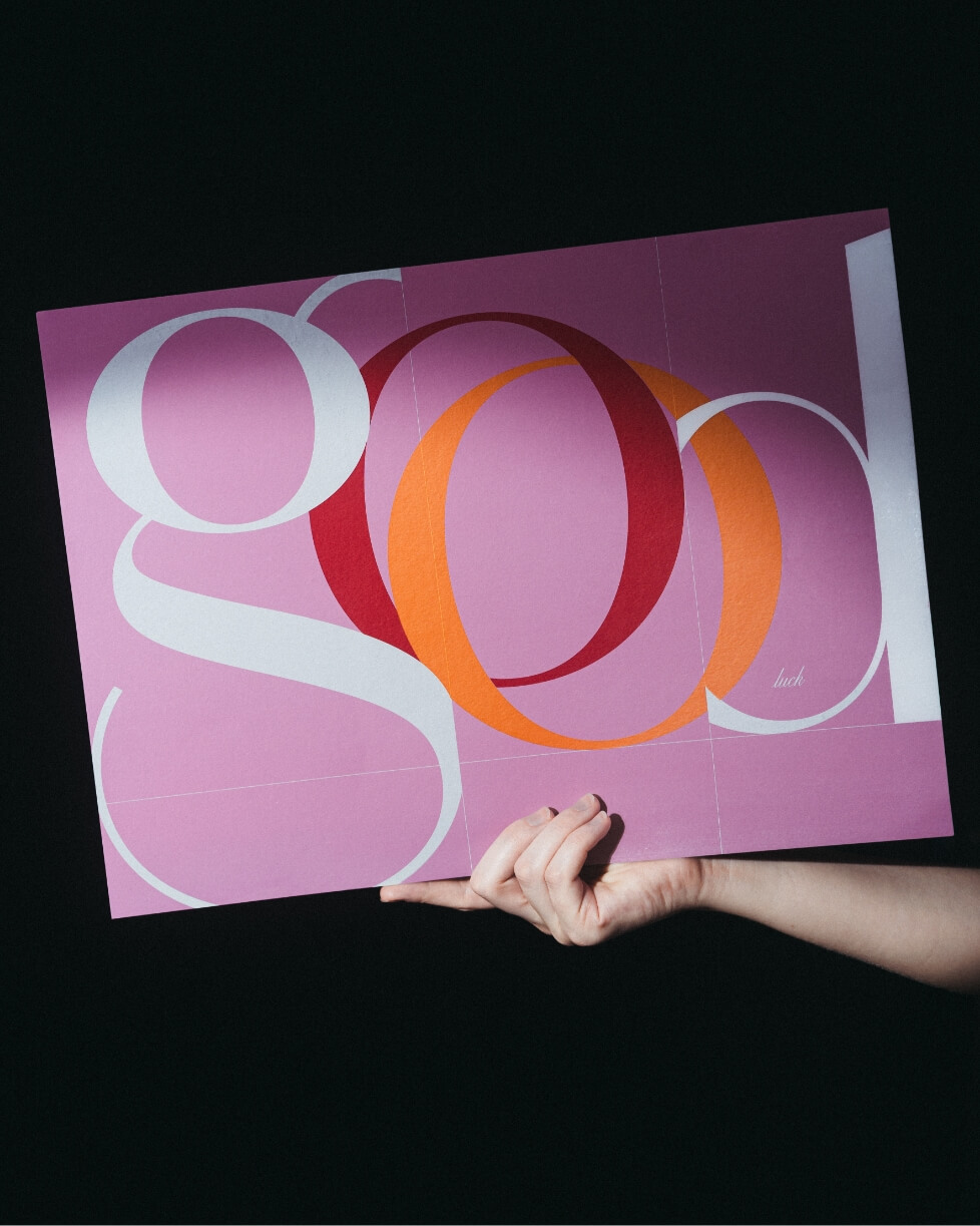
Trust the Basics
