CONCEPT · BRANDING
Liberating minds and bodies.
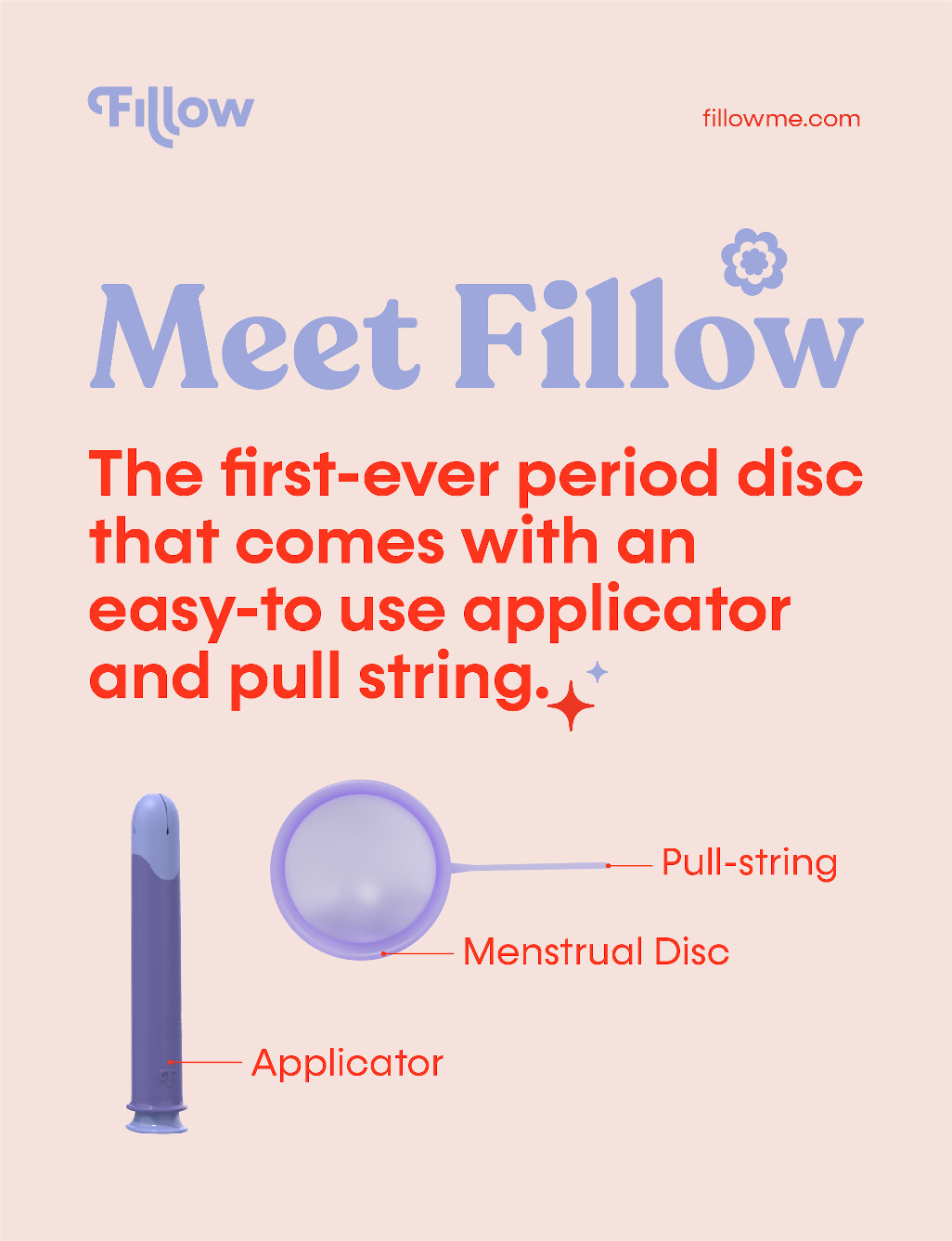
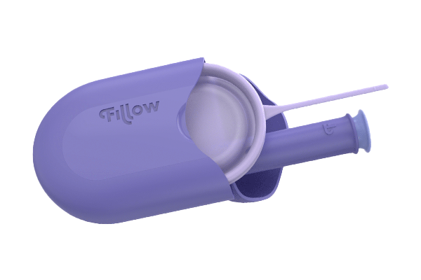
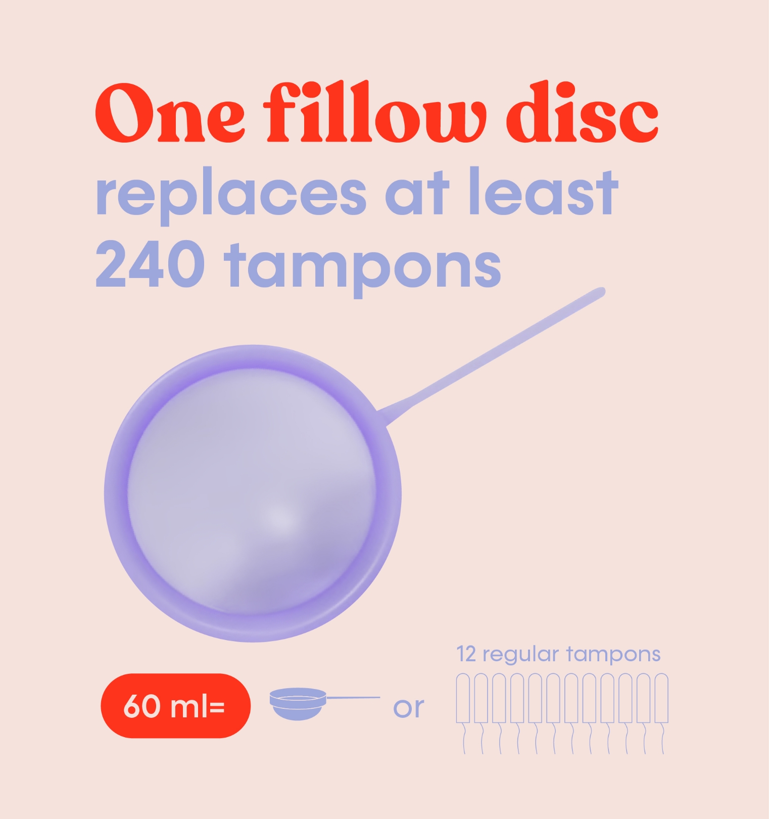
Most period care products fall into one of two extremes: short-lasting but mess-free, like pads and tampons, or long-lasting but messy, like menstrual cups. During a hangout, an unexpected leak inspired a group of women to rethink period care entirely. That moment sparked Fillow—a product that combines the comfort and convenience of tampons with the safety and 12-hour wear of menstrual cups. Fillow bridges the gap, offering modern women a solution that truly fits their lives. Shaping the brand’s untapped potential became our mission.












— Changing the conversation.
One Period at a Time.
Reimagining the status quo.
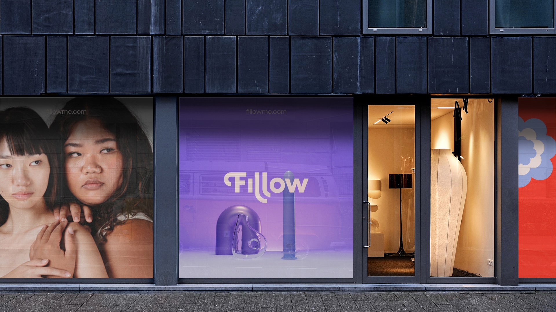
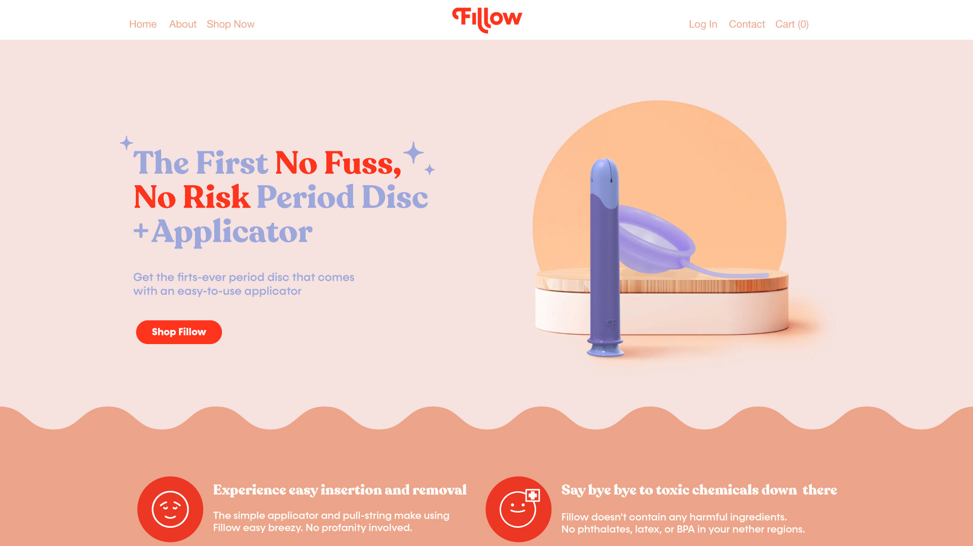
As a groundbreaking period care brand, Fillow sought to create a bold and modern voice that reflects authenticity, self-expression, and a stylish yet practical aesthetic. The goal? To move past the sterile, uninspired imagery dominating the category and craft a visual identity that resonates with socially conscious consumers seeking inclusive, body-positive period care.
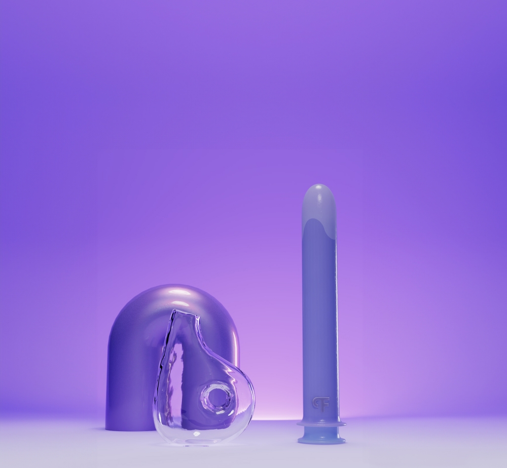



Designing a new standard.
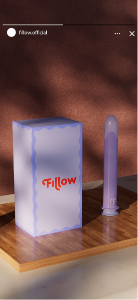
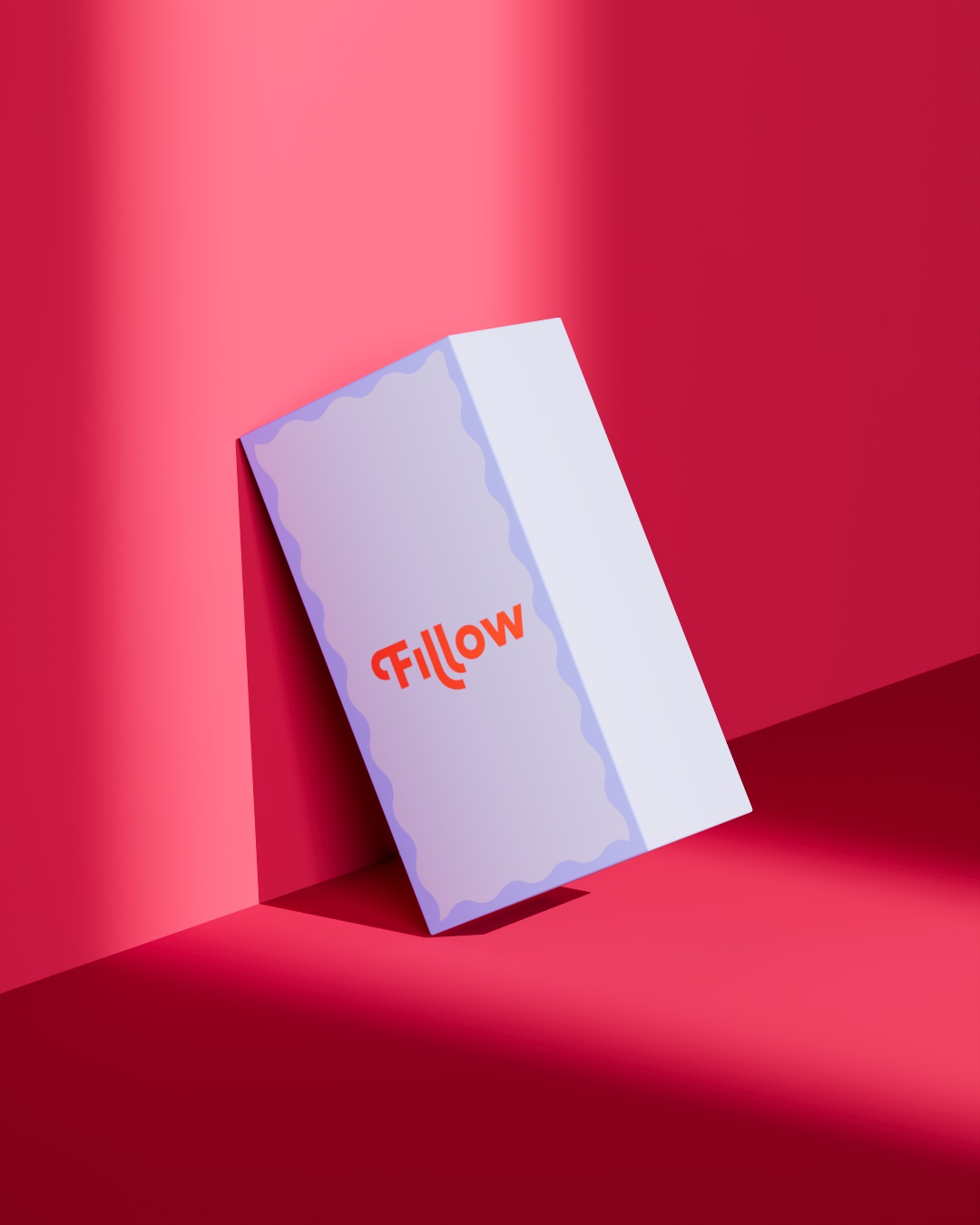
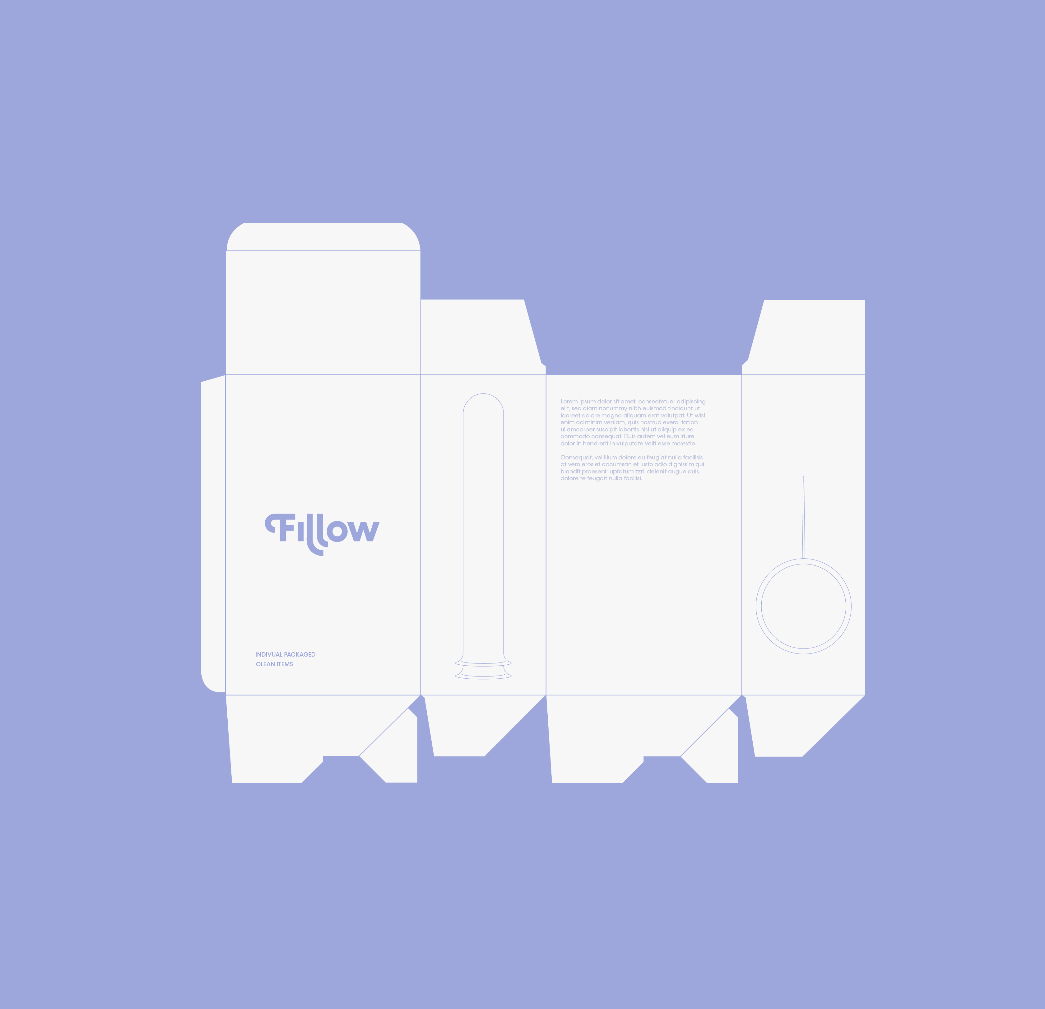
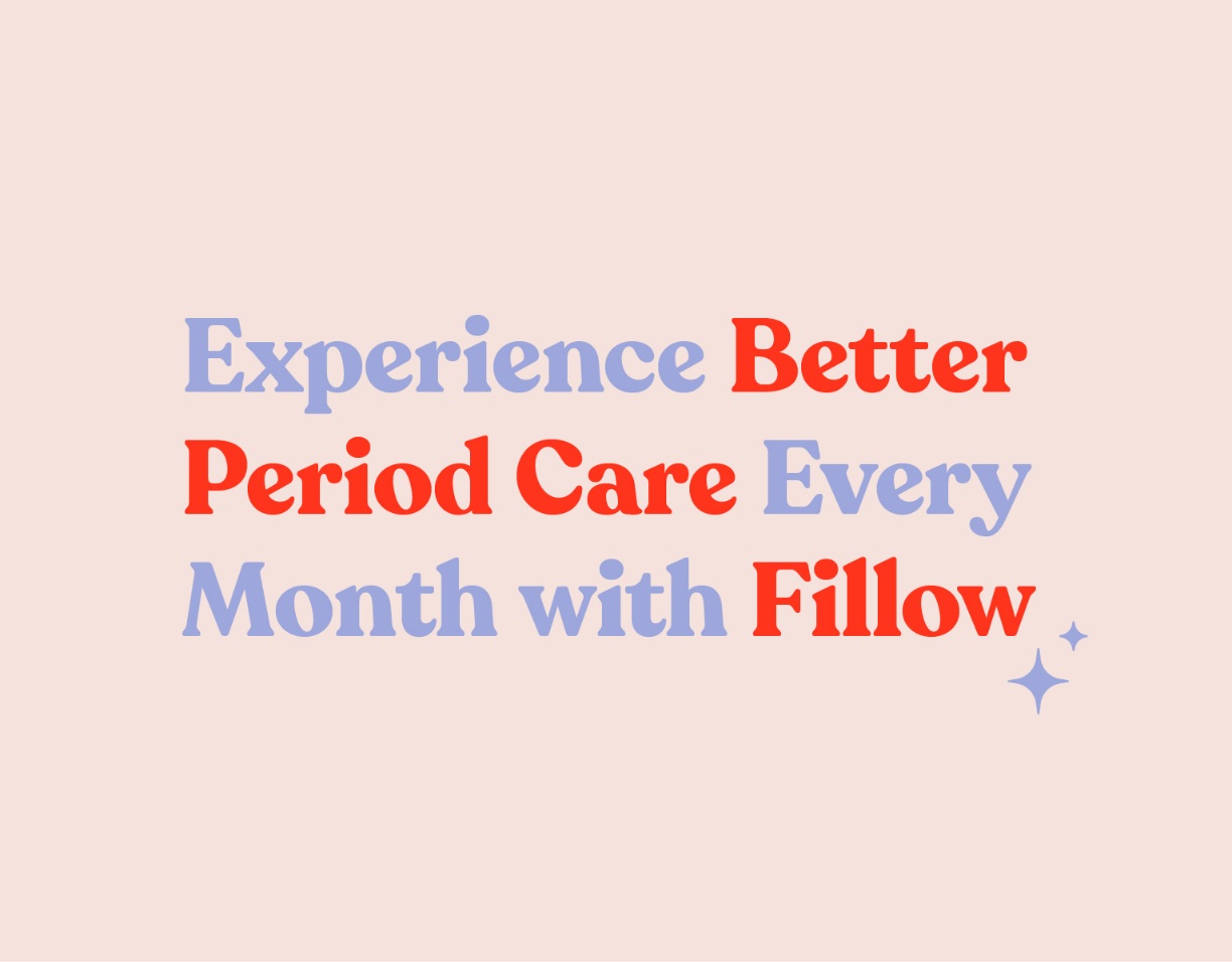
Inspired by Fillow’s mission to challenge stigma and champion sustainability, we crafted an identity that’s as fresh as it is timeless. Bold, oversized sans-serif fonts convey modernity and inclusivity, while the color palette moves beyond conventional pastels, grounding the brand in tones that feel real and approachable, resonating with those who value openness.
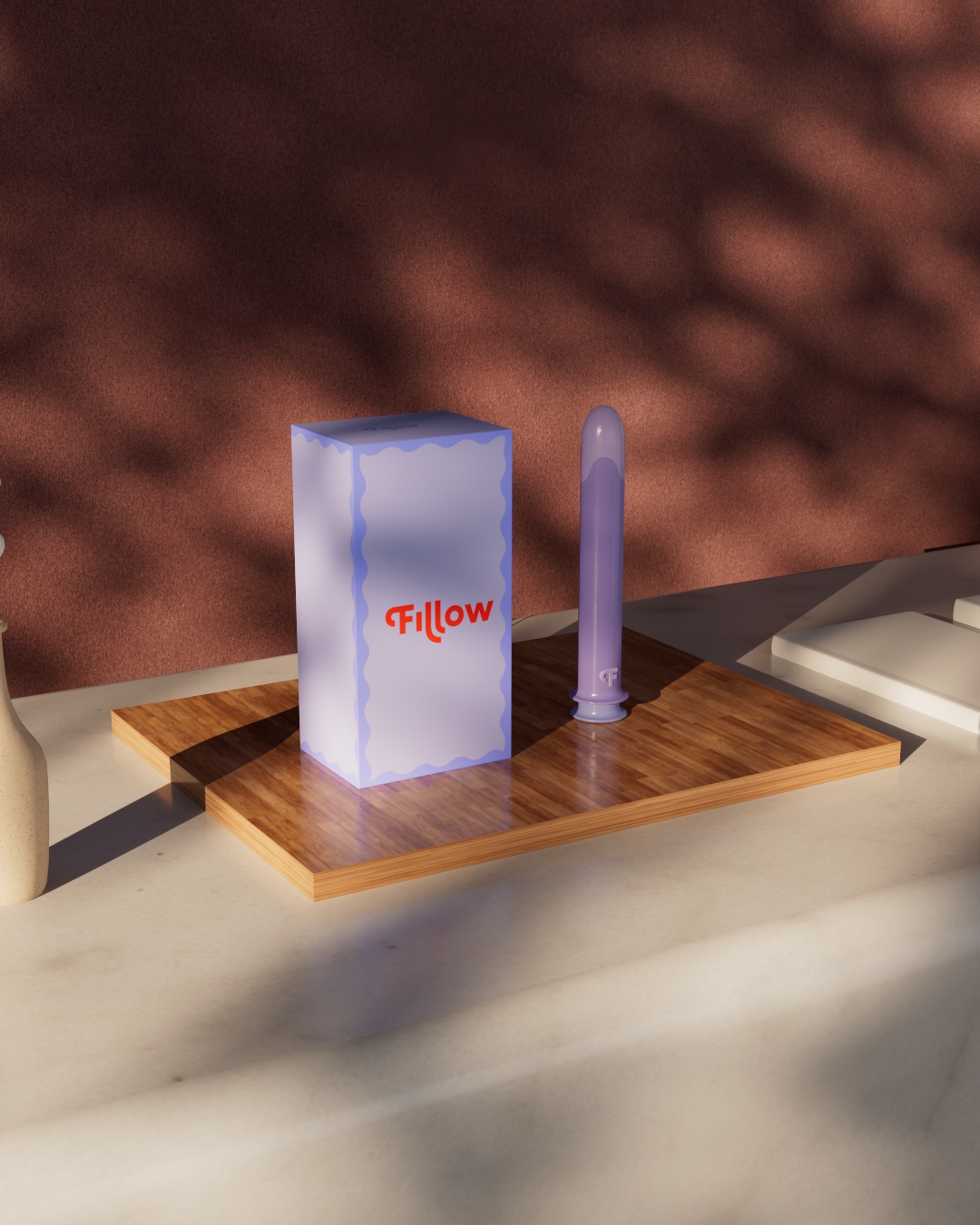
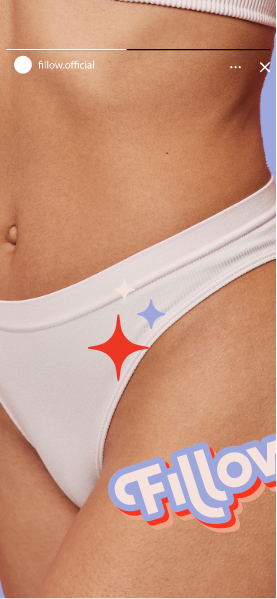
Imagery takes a similarly honest approach, highlighting women in their natural, confident state—diverse, unfiltered, and free from excessive styling. This focus on authenticity amplifies Fillow’s commitment to inclusivity, body positivity, and self-expression, while reinforcing its connection to a global community of women who value progress and sustainability.
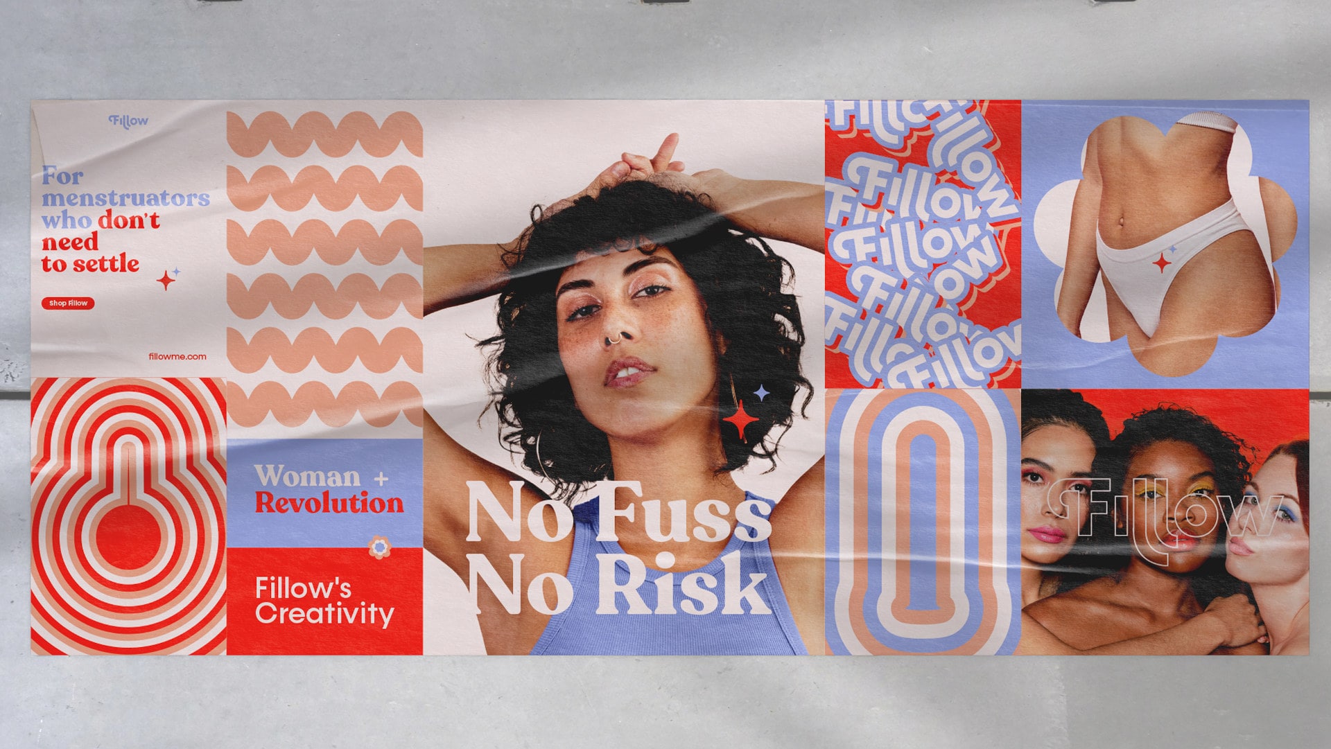
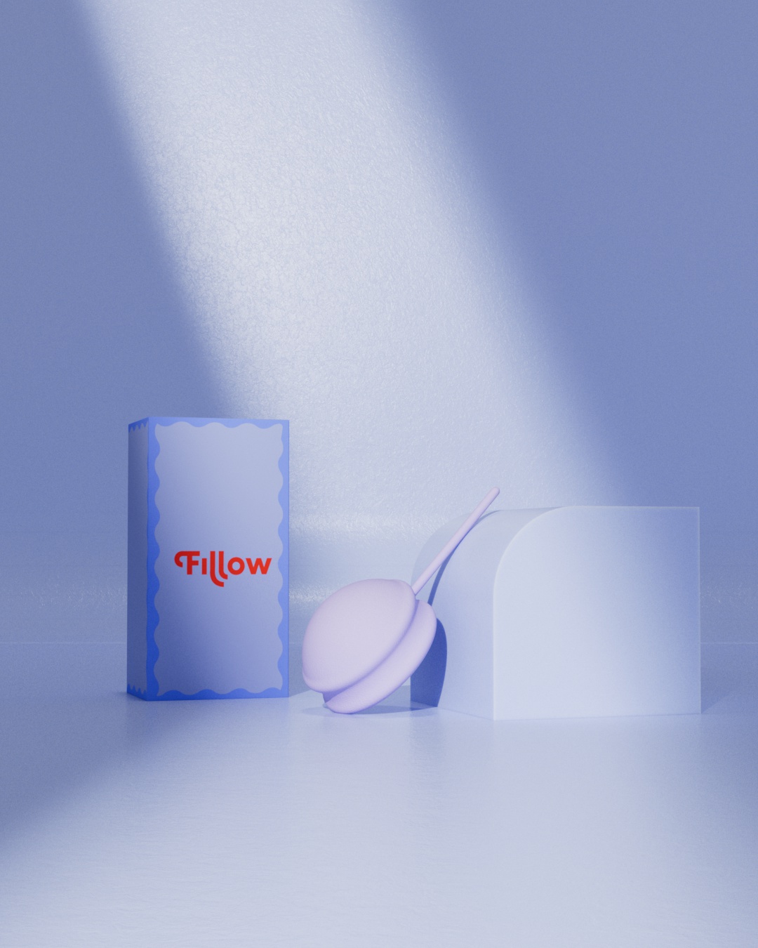
The result? A brand that redefines period care, designed for modern, active, and eco-conscious women who demand better. At our Studio, we’re proud to be part of this shift—pushing boundaries is what we do best.


