BRAND REFRESH · VISUAL SYSTEM · ILLUSTRATION · ICONOGRAPHY
From the farm to ice cream shop
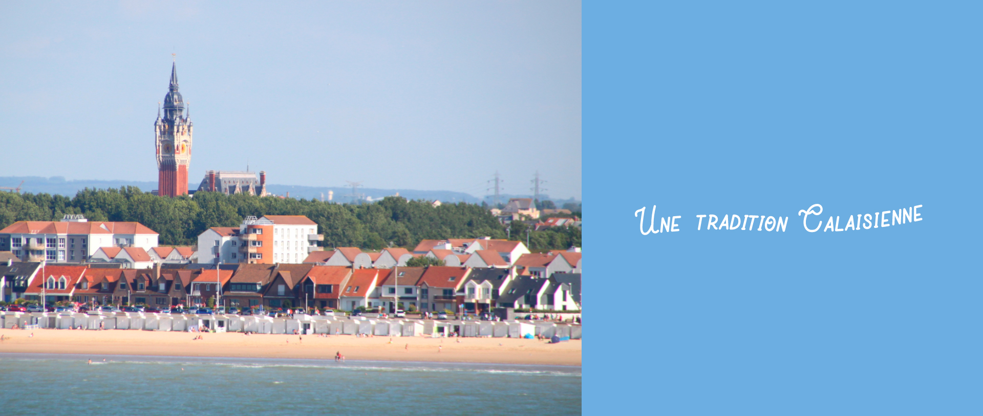
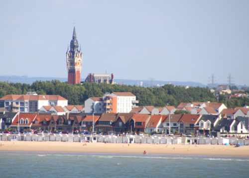
An unforgettable family weekends mean taking leisurely walks, spending time together, having fun, and enjoying the wonderful view along with the sea breeze while eating a delicious homemade Sigler ice cream. Doing this is a long-lived tradition in the city of Calais, France.
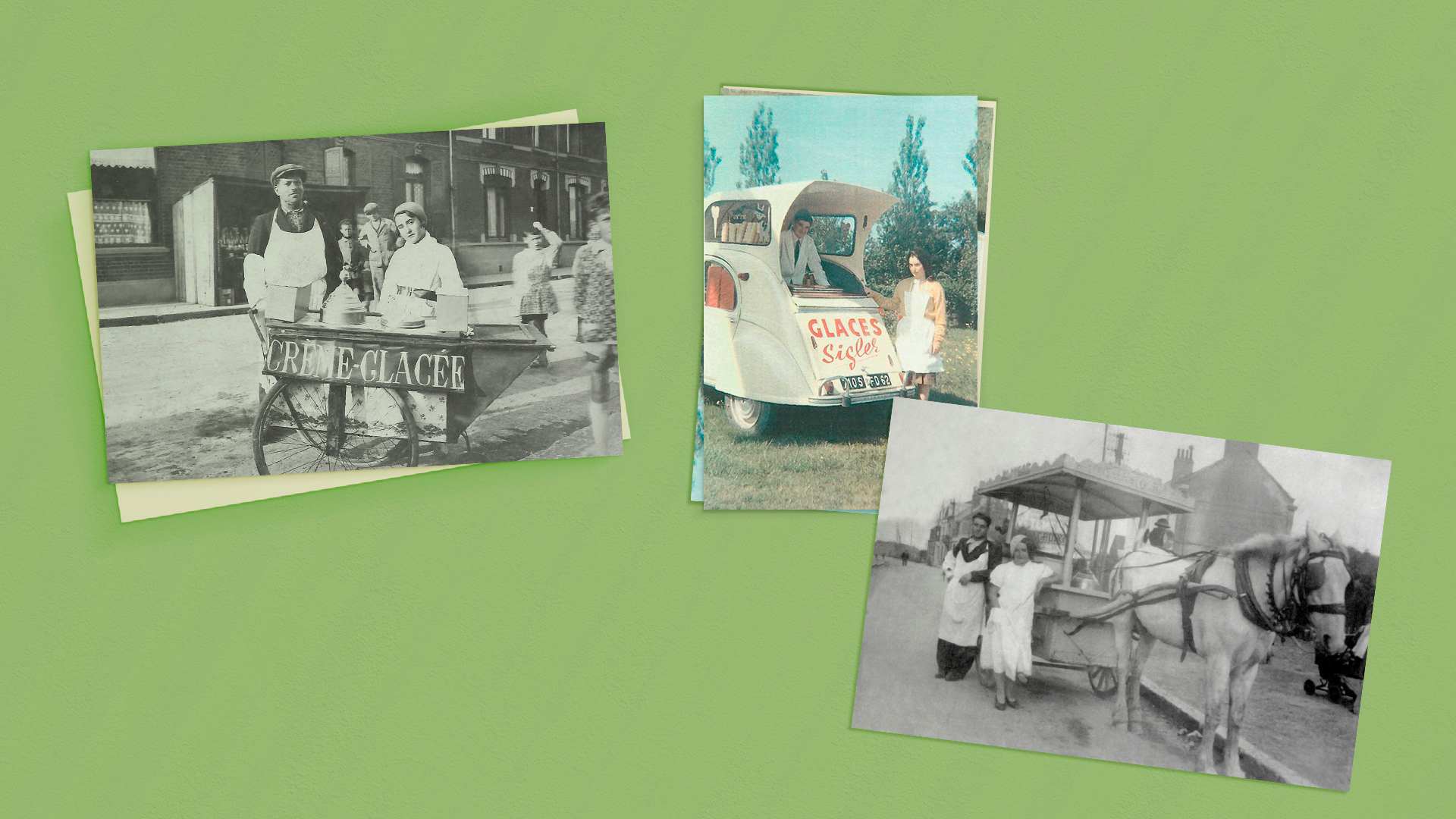
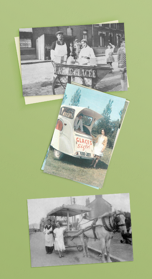
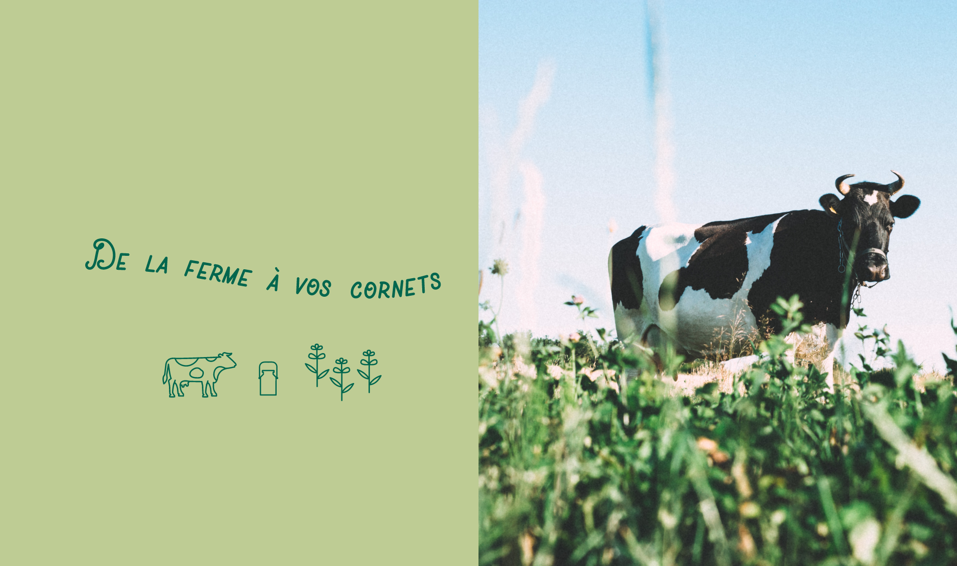
It all started in 1935 with a couple of ice cream lovers heading to the farm every morning to carefully select 100% natural and fresh ingredients for the preparation of the best homemade ice cream anyone had ever tasted. More than a family tradition, it has become the passion that drives Glaces Sigler to offer a delightful experience in the unique French style, generation after generation.
For the Love of Ice Cream
The brand needed a new look that showcased a tradition and artisan brand, but also the freshness and quality of their product.
For the Love of Ice Cream
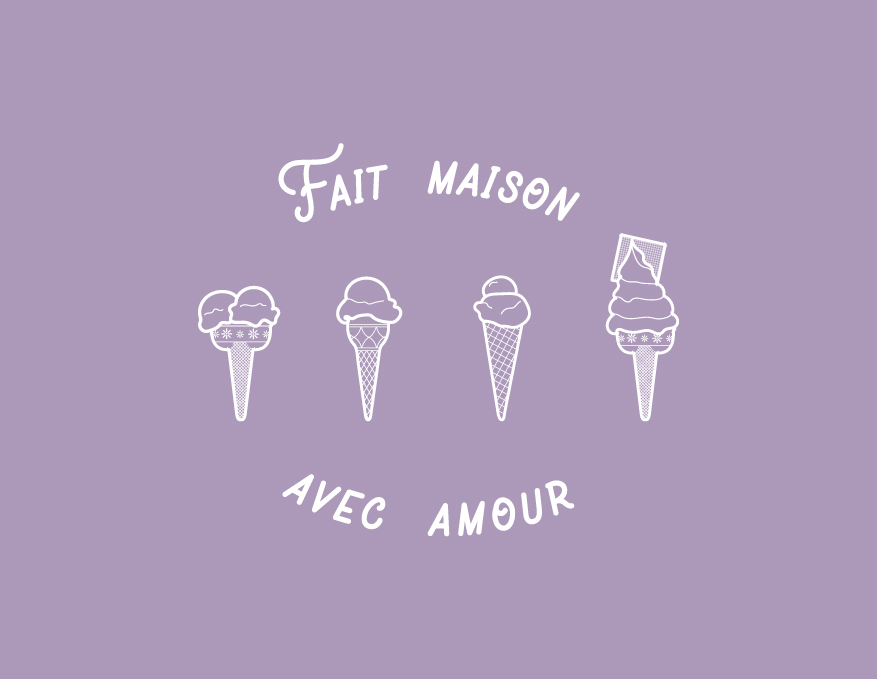
Following perfect family moments around a wonderful product, our graphic language is happy and with a distinctive homemade feeling.
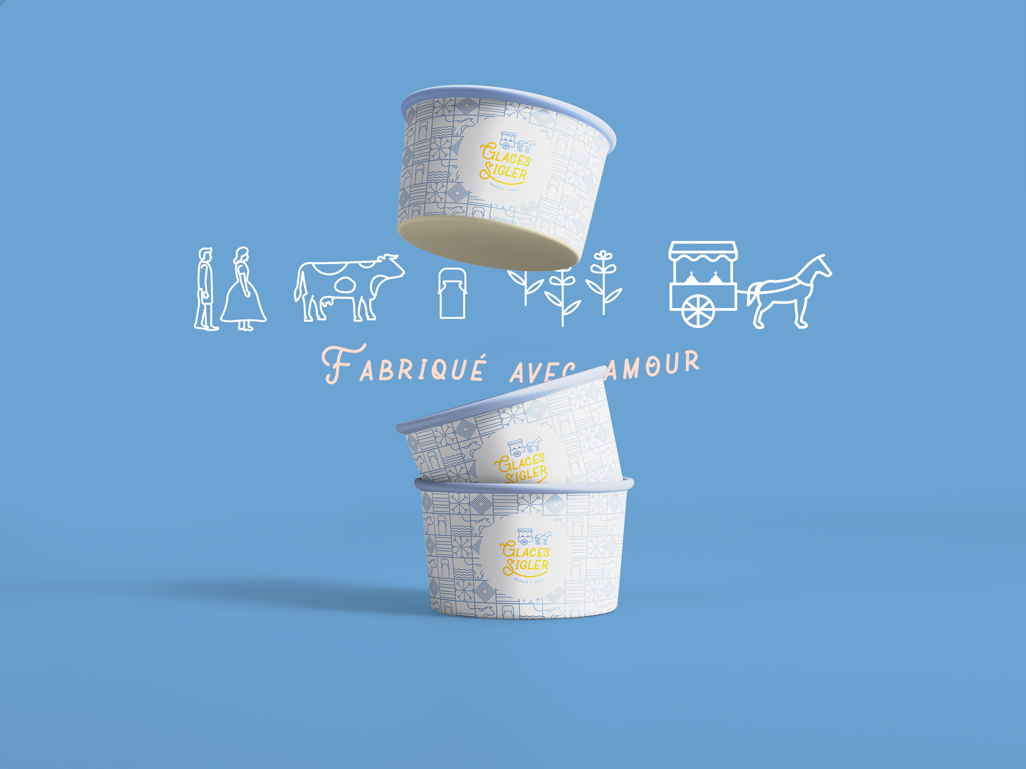
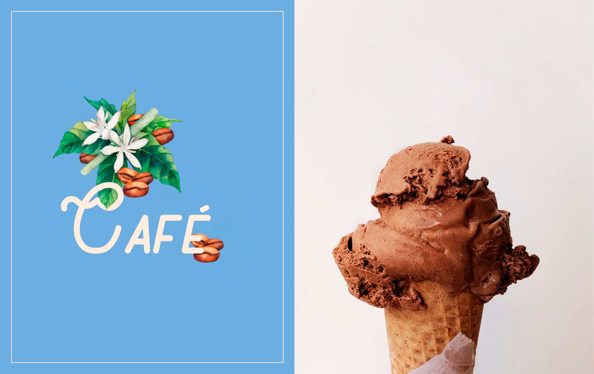
We created the logo, inspired by how the company began selling ice cream in a fantastic horse-drawn cart. We developed illustrations of the ingredients and patterns everywhere to add a handcrafted touch.
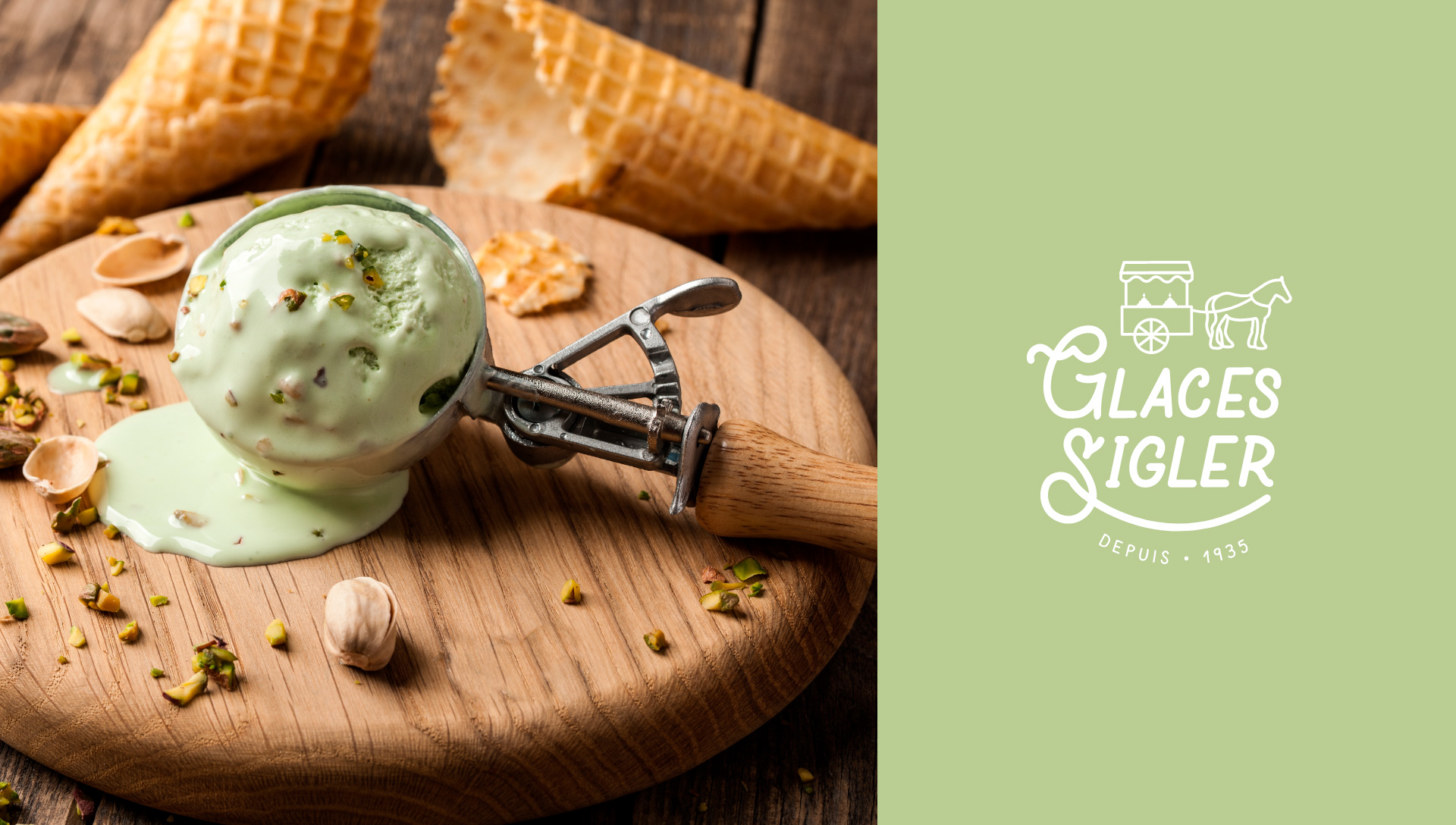
Our colors are inspired from the same pastel colors as the different-flavored ice cream. Our favorite: Violet for lavender, the main ingredient in the company's flagship product. The icons recall the story of the brand and its production process.
Glaces Sigler celebrates happiness. This new identity will take you to taste and smell the passionate fragrances of their creamy and irresistible ice cream.
